Review
Project: In 2019 our team was tasked to come up with designs for a Review feature inside Mango. We did not previously have a way for users to study content other than going through the lessons again so this was a highly anticipated feature! This new addition put the content into a timed pedagogy that would show you the cards at timed intervals; and eventually putting them into your long-term memory.
Team: UX- Me, Visual Designer, PO
01
Part 1- Ideation
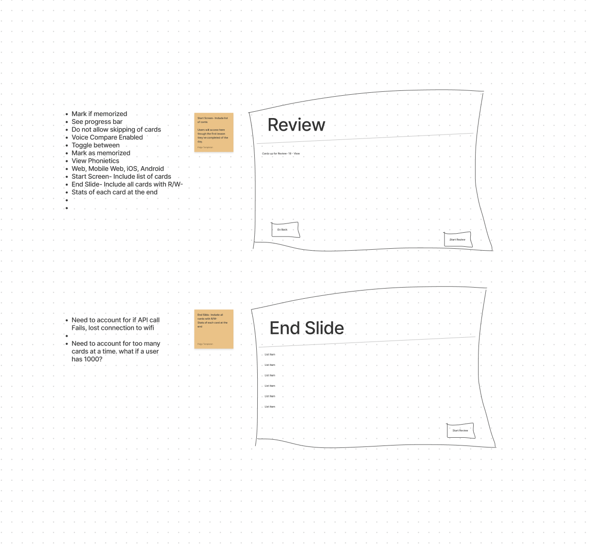
Our stakeholders came to us with a 72 page document on how the Review feature should work from a development standpoint. We took that information and parsed it down into interactions.


02
Part 2- Lo-Fi Design
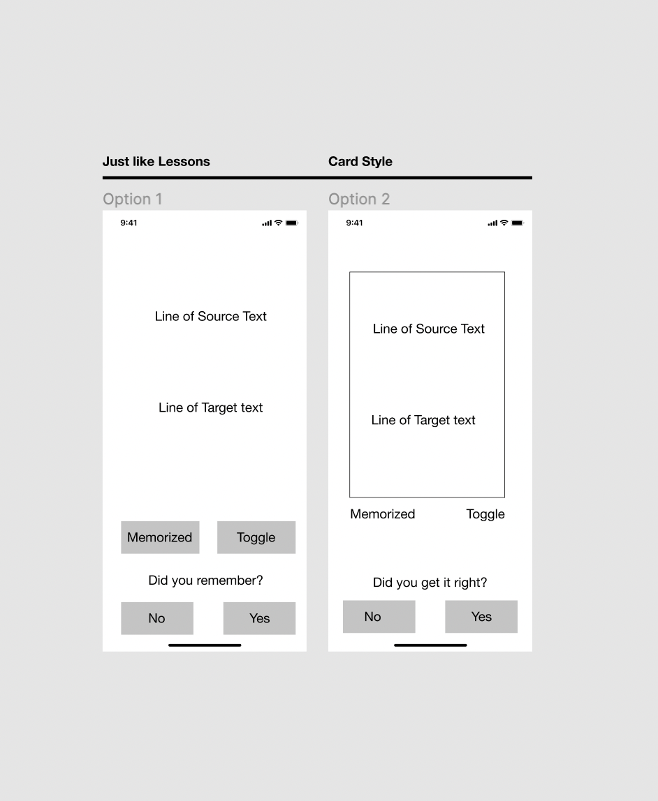
From there we put together a collection of different ideas for ways we could solve all of the user journeys in the feature.
03
Part 3- Hi-Fi Designs
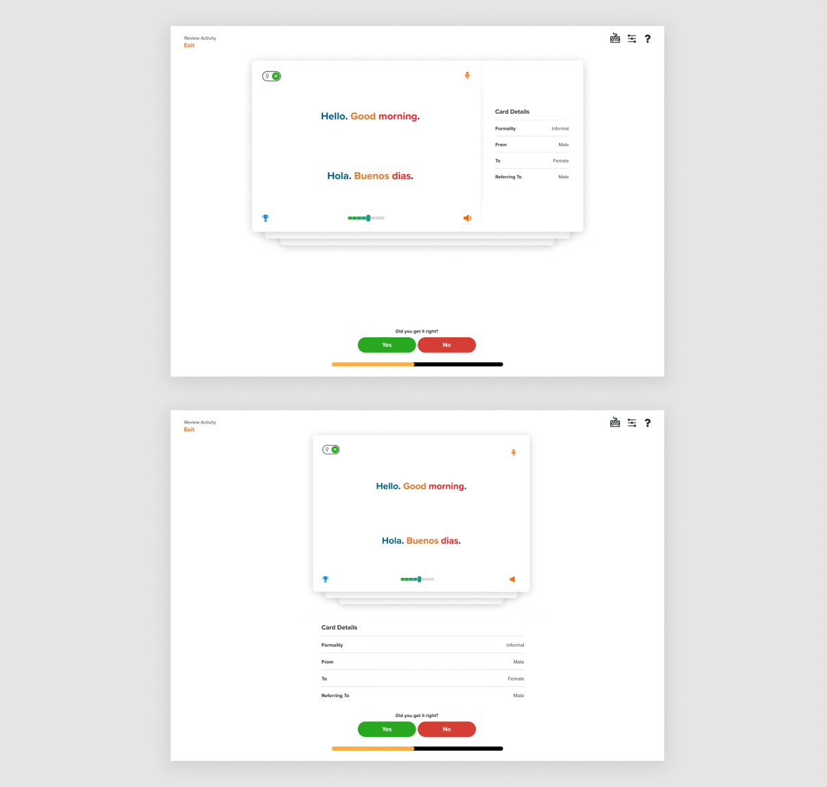
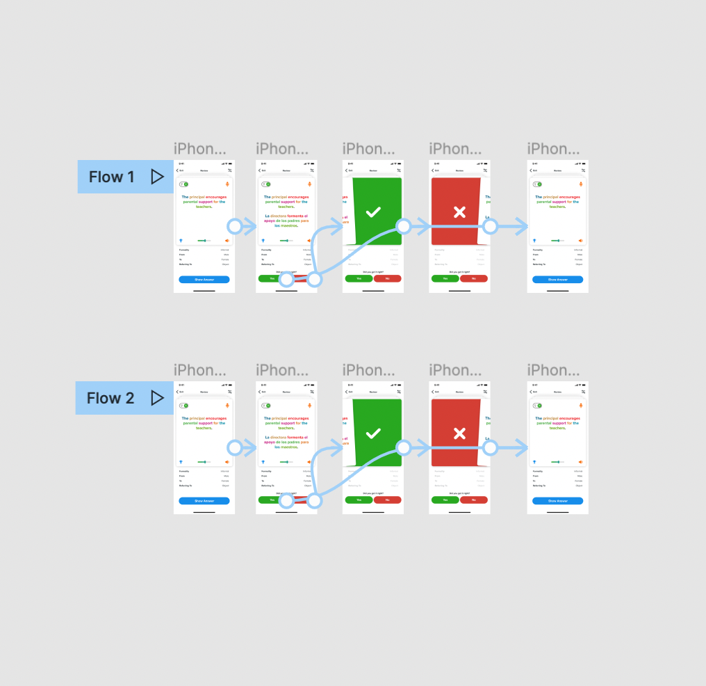
After creating a few different ideas in lo-fi we identified the top two candidates and created hi-fi designs. This allowed us to further work through different interactions and potential options.


04
Part 4- User Testing
We then tested the two different options side-by-side to see which one users liked better. We created test questions with hypotheses to quantitatively and qualitatively test the designs.
